I’ve been using Reeder for a few years now, but when Google Reader was shut down the the iPad and Mac versions were left out of commission as Silvio Rizzi built support for other back end syncing services. It’s been a great product though, and I’m not really upset about the time it’s taken to get this 2.0 release done. I’d much rather see a polished app done right than a clumsy app done quickly.
Reeder 2 looks very much like an iOS 7 app. If you’re still on iOS 6 the icon looks out of place nestled in amongst gloss, gradients, and drop shadows; but once you’re in the app it feels pretty nice. While using it I couldn’t help being reminded of Vesper. Animations and transitions are smooth and well thought out, even on the dated hardware of my iPhone 41. I’m particularly fond of the little labels that pop up underneath toolbar buttons as you press them. This is a great piece of interaction design that gives you an uncluttered UI without requiring you to you play guess-the-icon.

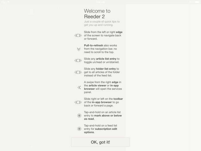
On the first launch of the app you’re presented with a gargantuan list of gestures to learn. For anyone who used the previous version this won’t be a big deal, but for new users I think this will be a major source of pain. Gestures are essential to getting things done in Reeder. Much of the value of the app comes from its ability to get you through your feeds quickly, which you can’t really do effectively without understanding how the gesture system works. You can’t go back to the list that explains all the gestures after you’ve dismissed it - this is your one and only chance to learn how to use Reeder properly. If you miss something, or don’t fully understand what the text is trying to say, then I guess you’re on your own. There are better ways to teach people how to use an app, and presenting a list of stuff that we’re expected to memorize does no one any favours.
Once you get past that hurdle, you’ll find that this version really is easier to use than the one it replaces. Text is bigger and clearer, you can swipe from left-to-right to go back to the previous menu2, you can even grab the title bar and invoke a pull-to-refresh without scrolling back to the top of a list.
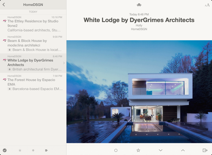
Unlike the previous version, Reeder 2 is a universal binary that works on both the iPad and iPhone. The iPad version is a complete rethink of the app, ditching the grid of icons for a multi-column layout similar to how Twitter’s iPad app used to work back when Twitter was run by people who knew what they were doing. You can push columns around with playful springiness and fly through your unread list pretty quickly. Photos take up the full width of the display now, which on a retina display really does look neat.

My only gripe about the iPad version is the buttons to flick back and forth between posts are now at the bottom of the display rather than the side. When they were on the side you could hold your iPad in both hands, and have the buttons within swinging distance of your thumb. Now you’ve got to grip the device awkwardly every time you want to quickly skip a post.
I know I’ve listed a few complaints here, but Reeder 2 really is a great piece of software, and for five bucks it’s a no-brainer. Go buy it.
-
I know. I know. I’m upgrading this year, but can’t decide between the Galaxy S4 and the iPhone 5S. ↩
-
I’m not sure who first came up with the idea to do this. I first saw it in Sparrow, but since then I’ve learnt the iOS music app has it too (even in iOS 6 you can swipe left-to-right on the album art while a song is playing and you’ll go back to the songs list). Either way, it’s a very good idea that’s become a system-wide part of iOS 7. ↩