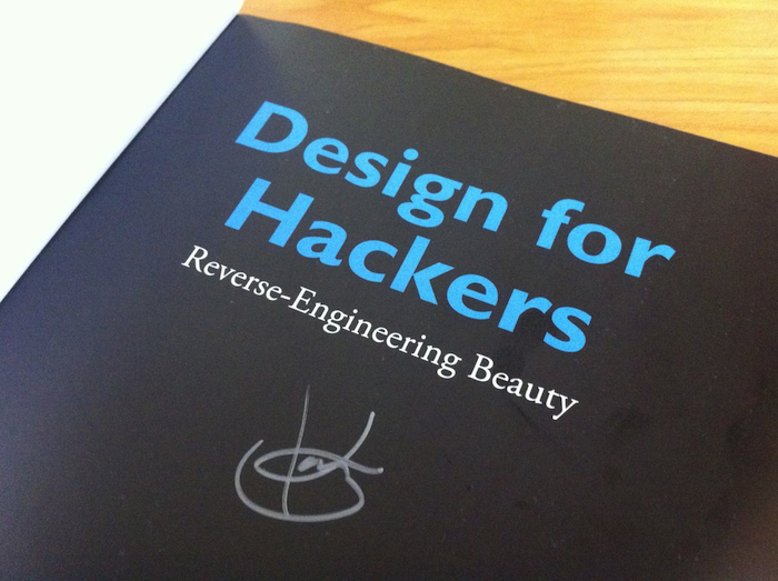
I first heard about David Kadavy’s book Design for Hackers on Kickstarter, where he was raising funds to go on a book tour. The irrational part of my brain that thinks autographed copies of books are somehow better than the regular ones disregarded the fact that international shipping would make this one of the most expensive book purchases I’ve made in years, and hit the “donate” button. To be fair, the $75 that I ended up spending turned out to be worth it.

Look! An autograph!
I’m sure many of you reading this started out creating user interfaces in the same way I did. We can appreciate good design and pleasant aesthetics. We’ve got this idea in our heads that because we can recognise good design and see it in the work of others, that we should be able to create it ourselves. I mean, how hard could it be?
So one day you sit down in front of your favourite text editor and whip up a web site that you’re sure will get you a prime slot on CSSMania so that finally your genius may be recognised. You’re feeling good about the project, until the moment comes when you open up a fresh browser window and see the crime-against-nature that you’ve created glaring back at you.
The problem isn’t that you’ve created an abomination and can’t recognise it — you know you’ve just spent a couple hours churning out crap. The problem is that you can’t articulate why your stuff is bad, and more importantly how you could make it suck less.
Enter David Kadavy…
Design for Hackers is a great way to skim the surface of many areas of design. You get a beginner’s guide to just about everything any half decent programmer needs to know about colour, typography, composition, and proportion.
In particular when it comes to typography I’ve found it difficult to find a decent guide using fonts with computer displays. Most of the classics focus on print and how ink appears on a page. Anyone who’s spent five minutes with a Kindle knows that the medium you’re reading on dramatically affects the way you experience text, and choosing a font for use on a display requires an entirely different kind of thinking to choosing fonts for print. Design for Hackers really shines in this department. I’ve found myself referring to the book’s appendices a few times since my first read through, and it’s really helped clarify my thinking about typography.
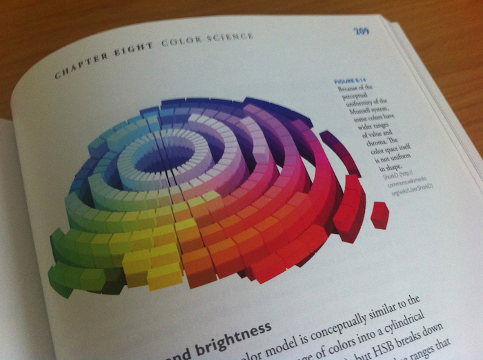
The book itself is well designed (it would be pretty ironic if it wasn’t). There’s plenty of eye candy, with full colour diagrams scattered throughout. It’s a real pleasure to casually flick through. You’ll often find yourself coming across things that grab your attention and spike your curiosity.

Kadavy spends some time in the early chapters talking about why design matters, reflecting on his time in Europe. There’s one particularly good anecdote where he describes the reaction tourists first have to the Pantheon in Rome, and he uses this to illustrate how good design is built up in layers that play off one another to achieve a harmonious whole. There’s really no arguing that these chapters that draw on Kadavy’s personal experience are just downright better than the rest of the book. Later chapters on colour and typography are densely packed with information, and this makes them a great reference guide. However, as a book designed to be read from start to end, it’s often difficult to see how you’d apply what you’re reading about. I’d like to see future editions include walkthroughs of a design project, or anecdotes about how the author solved problems he encountered in the past using the ideas each chapter discusses.
On the whole, it’s an excellent first edition of a book that could very well become a classic of software writing. If you’d like to understand what the designers on your team are talking about, and not embarrass yourself in front of them with your creations, this is the book to start with.